
4 Website Tricks To Get More Email Subscribers (and what one thing you should take off your site right now)
Most small online business owners make the four same mistakes with their websites when trying to get website visitors to sign up to their email list.
These four mistakes mean that it takes longer to build up your list, but it also means you are unable to interact with your website visitors – because a new web visitor never returns (check this in your Google analytics data and you’ll see what I mean).
Last month I launched a beta product, ‘Conversion Clinic’ which I knew there was a demand for amongst my target market.
I had a great response and and after doing fifteen of these video reviews, I realised they were making the same four mistakes.
So what are these mistakes and how can you overcome them?
The first and most important one is to have the most almighty, fantastic, shiny and valuable piece of incentive content to give to people for FREE in exchange for their email address.
If you (politely) ask for an email address in exchange for ‘updates’ or for your ‘newsletter’ you are making the first most important mistake.
If your website is chocka block with amazing, exclusive, valuable articles and blogs, you may get around 1% of your website browsers to sign-up for an ‘update’ or ‘newsletter’.
But why be happy with that, when with a bit more effort you could skyrocket that number?
#1 Great opt-in incentive
You MUST have a freebie or hook to encourage people to sign up.
No-one signs up for ‘updates’ or ‘newsletters’ these days and so make sure your opt-in incentive:
– Is specific & relevant to your target market
– Showcases your CORE skills/knowledge area
– Solves your visitors’ problem
– Gets them a result
– Is compelling and as brilliant as your paid-for content (not fluff or wishy washy)
Think about the format that works for your audience, what’s going to get them excited? It can be anything so just pick the one that you visitors will love and run with it:
– Ebook, ecourse, video course, free program, checklist, worksheet, recipe card, shopping list, cheat-sheet, guide book, step-by-step guide, checklist…the list is endless.
But most importantly it must be Grrrreat.
#2 Header navigation
Think about it. If you offer people lots of choice, options and give them loads of decisions to make, they are more likely to run away screaming than to make a good choice.
This is called analysis paralysis and the outcome is bad. You want to focus on getting visitors onto a page where they can understand your business and sign-up quickly.
So try to keep your main navigation to at most 5 links.
“But Fiona, which ones are important” you might ask?
Here are the ones you should have:
– Home (you can remove this too if your logo clicks through to your home page)
– About
– Blog
– Free X (this is a page or link to your hook/freebie for sign ups)
– Services
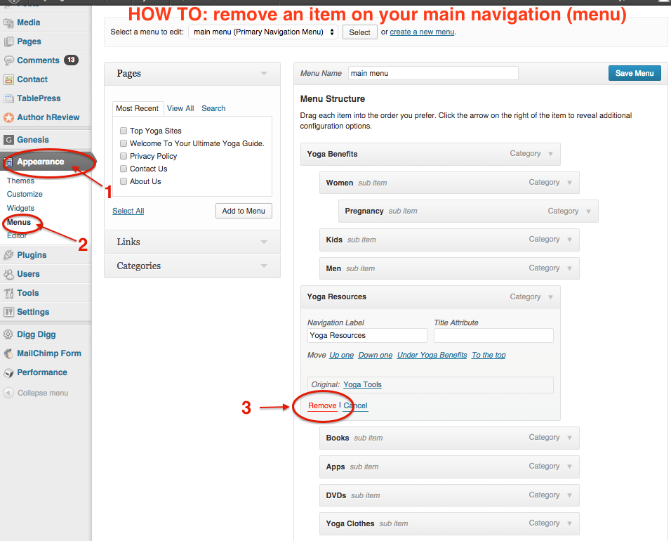
In wordpress here’s how you remove an item on your navigation:
#3 Social proof
I see a lot of websites with a ‘Testimonials’ page. Which is a great idea, because if you have some true love-bombs from clients you want to share them with your prospects.
But there is a better way to showcase these golden snippets.
Imagine you’ve found a website (lets say via Google search) and you’re reading the blog thinking ‘hmm, great stuff’. Then you start browsing the services page and see that the owner has a brilliant ebook freebie that looks perfect for you, but well, you’re not yet quite convinced….you already get so many emails…
Do you a) go back to the main navigation, find the ‘testimonials’ page, scroll through a dozen other paragraphs to find what some random person said once about the ebook because you’re sure that will convince you?
or b) move off that page because another blog post caught your interest? (and never, ever return)?
Get the picture?!
So here’s the trick.
Add your testimonials directly into your email capture box or freebie opt in page.
When you can prove that someone else loved your ‘freebie’ enough to say how great it is, you will instantly get more conversions.
And a sneaky PRO-tip here: If you have a testimonial from somebody well known in your niche, even better! Be sure to add that to your opt-in box with a picture of them for even more credibility.
PLUS, this tip works for your paid-for products and services too.
#4 optin box at bottom of blog post
This might seem obvious – but most people don’t do it.
Q: If someone reads all of your latest blog post, right to the very end, do you think they are a raving fan or a casual browser?
A: A raving fan (who probably loves you and wants more of your carefully crafted content!)
So make sure you capture their email address once they’ve read your blog post.
Want an easy way to add opt-in boxes to anywhere on your wordpress site?
Sometimes I use a drag and drop wp theme to create boxes but I also love the Magic Action Box plug-in which makes it easy to capture email addresses from anywhere on your site and add these automatically to your email service provider.
(Here’s a good tutorial on adding a sign up box into a blog post with magic action box and Mailchimp or get a brilliant webinar on MAB and Mailchimp here)
So there you have it, 4 mistakes that most small online businesses make when they are trying to get more email sign-ups and don’t forget to download the free giveaway below – a printable pdf listing 6 website tricks and all the tools I use to boost sign-ups online.